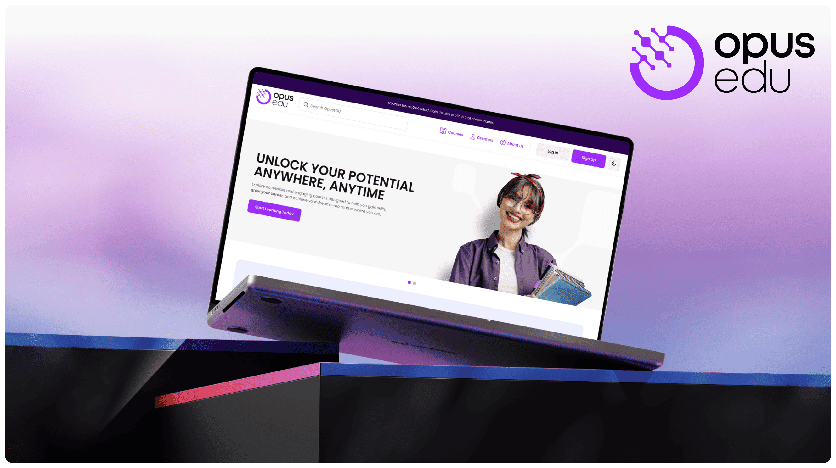
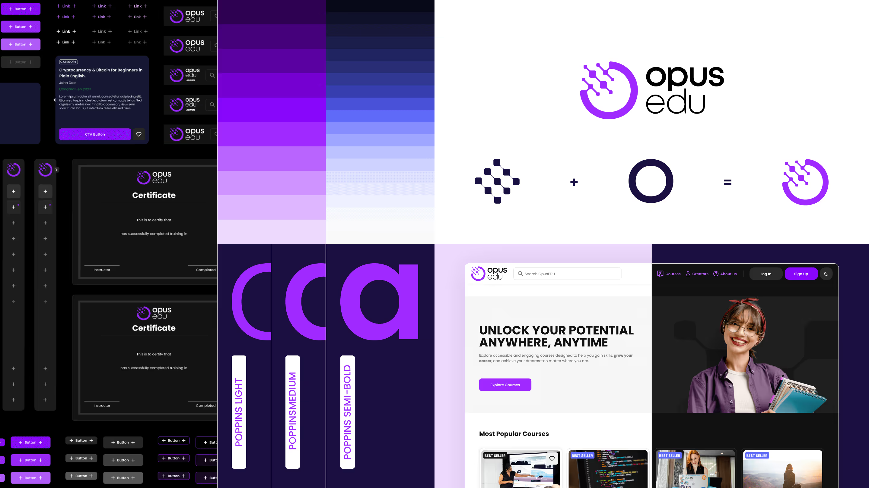
Before any UI was considered, we focused on "why." We developed a visual identity centered on trust and accessibility to directly address the skepticism of new users. The logo, combining the letter O from Opus with chain connected squares, which represents the Blockchain. Those combined establishes the idea of "Web3 Learning."
After that we delivered a comprehensive component library in Figma. This wasn't just a style guide; it was a complete toolkit that empowered the development of the UI itself, helped maintaining consistency, and helped the scaling of the platform with confidence.


